

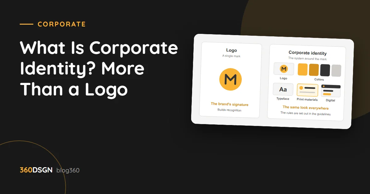
Corporate identity is the set of rules that makes a brand recognizable as the same brand wherever it appears. The short answer: a logo is one part of corporate identity; corporate identity is the logo, the colors, the typefaces and all the rules for how they are used. In this post we explain the difference between the two, what goes into brand guidelines and when an identity needs a refresh.
The difference between a logo and corporate identity
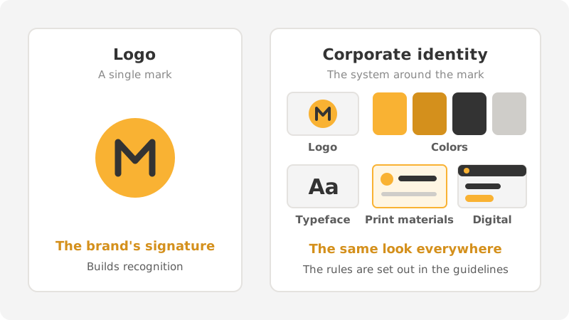
A logo is a mark. It is like the brand’s signature; it sits on the sign, on the business card, in the top corner of the website. A good logo makes the brand recognizable, but it does not determine how the brand looks everywhere else.
Corporate identity is the system around that mark. Which color will be used? Which typeface will headlines be set in? How will the logo sit on a dark background? How will a social media post and a proposal document look like they come from the same company? The answers to these questions lie in the identity.
There is an easy way to see the difference: cover your logo with your hand. Do your business card, your website and the wrap on your vehicle still look like they belong to the same company? If they do, you have an identity. If they do not, all you have is a logo.
What goes into brand guidelines?
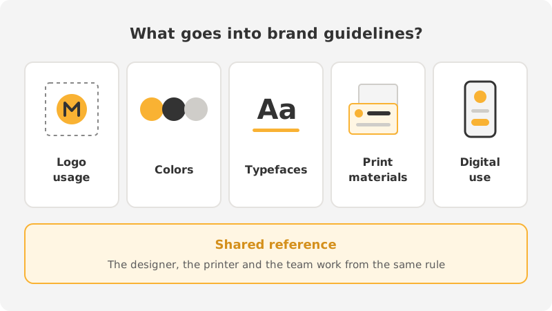
Brand guidelines are those rules written down. You hand the same document to the designer, the printer, the sign maker and your own team, and everyone works from the same rule. Good guidelines cover five areas.
Logo usage
The primary logo, the single-color version and the versions for light and dark backgrounds all go here. The clear space to leave around the logo and the smallest size it can be used at are specified. What not to do is shown as well: stretching the logo, changing its color, placing it over a busy photograph and so on.
Colors
The primary color, secondary colors and neutral tones are defined. Each color is given in CMYK for print and in RGB and HEX for screen. It looks like a small detail, but it is what stops the same yellow coming out one way at the printer and another way on screen.
Typefaces
The typefaces for headlines and body text are set, along with their weights and size relationships. The chosen typeface needs to support Turkish characters fully and be usable on the website too. Otherwise one typeface appears in print and a different one on the site.
Print materials
Ready-made designs for the most commonly used print materials are added to the guidelines:
- Business card, letterhead, envelope and folder.
- Cover and page layout for catalogs and brochures.
- Signage, vehicle wraps and packaging.
- Proposal, invoice and presentation templates.
Which materials you need depends on the business. For a restaurant, the menu and packaging come to the fore; for a manufacturer, the catalog and the trade show booth.
Digital use
Today, the first encounter with a brand mostly happens on a screen. That is why the guidelines should also cover the profile image, social media post templates, the email signature, the site icon and the look of interface elements such as buttons. It is through this section that the identity carries over into website design and social media posts.
When should a corporate identity be refreshed?
An identity is not something to change often; recognition builds up over time. Still, some situations put a refresh on the agenda:
- The business has changed. There are new product lines, new markets or a different target audience, and the old look does not convey that.
- The logo does not work on screen. It is illegible at small sizes, does not fit a profile image and disappears on a dark background.
- Inconsistency has piled up. Over the years every job has been done in different colors and typefaces, and no single look remains.
- The structure has changed. The company has merged, changed its name or been brought under a new brand.
A refresh does not always mean starting from scratch. Most of the time it is enough to simplify the logo, clarify the colors and put the rules in writing. Before letting go of a recognized mark, you need to decide what is worth keeping.
How do you prepare for an identity project?
Having clear answers to a few questions before design begins shortens the process. Who are you selling to? What sets you apart from others doing similar work? Where will the brand appear most: on signage, on packaging or on screen?
These answers become the basis for design decisions. The “does it look nice” debate gives way to the question “does it represent our business accurately”. It also helps to bring your old logo files, printed samples and a few brands you like to the first meeting.
In short
A logo is the brand’s signature; corporate identity is the system that makes sure that signature is written the same way everywhere. When the rules are set down in guidelines, the result looks like the same brand no matter who does the work.
At 360DSGN we handle the whole process under one roof, from logo design to brand guidelines and from print materials to digital templates. For details, take a look at our corporate identity page or contact us.